Gecko Engage Design Concept
The Gecko Engage platform is a great piece of software but it's not without its flaw...of which I've been known to point out a couple of times 😀.
A redesign of the system would take huge resources that we can’t afford right now (we’re too busy working in some awesome new features). So…in my spare time away from Gecko I decided to delve into creating a Gecko Engage platform concept, in the hope that one day, seeing these visuals may inspire the wider team to take on my ideas and make them into a reality. Fingers crossed!
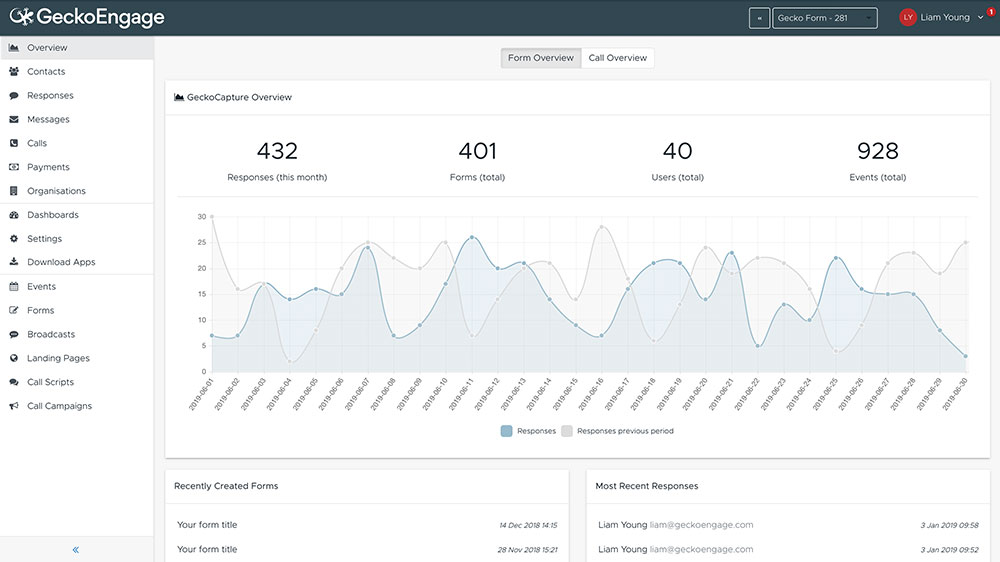 The current dashboard and bloated navigation.
Getting rid of the bloat
Now, it has to be said, the Gecko Engage platform does a LOT (big up the dev team for keeping on top of things)! But, the sheer scale of the system has caused functionality to be added on top of functionality and somewhere along the line the user experience has been forgotten about.
To put this into perspective, there are sixteen main navigation items!
My first train of thought was to actually look at which menu items are actually used. Step forward the amazing Pendo. We have just recently started using Pendo to track our users movements around the system and it has really started paying off. What I discovered was that there were a handful of menu items that were consistently clicked, and that these items were actually quite a bit down the pecking order. So, I looked at which items I could potentially lose altogether and which ones I could merge. I ended up with a much simpler, easy to navigate menu.
Another couple of improvements I added to the menu were creating quick links to things like “add new”. Before, you would have to click Events and then click Add New for example. My idea is that the menu flies out as you hover providing quicker ways into the system. A second improvement was to add some key settings to each section. All settings are stored within their own section, so by doing it the new way, we could lose the settings section from the main menu.
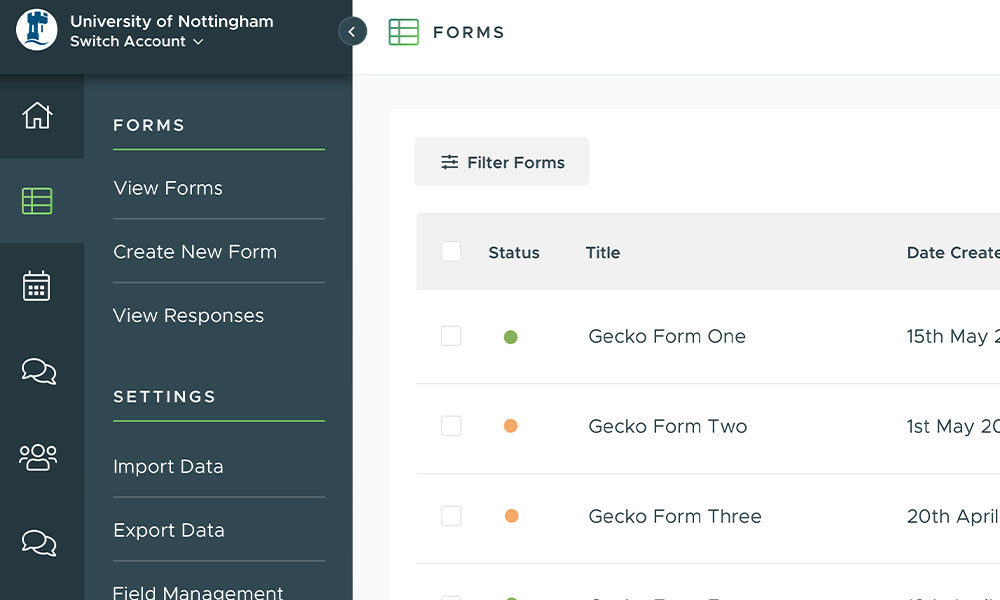 My proposed menu solution. Quick links and related settings now feature.
Consistency in brand
As a designer, one with a branding background, consistency of brand is an absolute must. So, it blew my mind to discover that we allow clients to change the branding of our own product to suit their own institutions branding.
If I had my way, this feature would be removed, after all…it’s Gecko’s product. Not only that, by allowing others to control their own accounts, we could be running into unbeknown issues around accessibility etc.
With that in mind, I redesigned the system using the Gecko style guide. Keeping things fairly neutral with the dark grey tones but then using the Gecko green as an accent. It’s a pretty kick ass combo in my opinion - we should be using it more 😉.
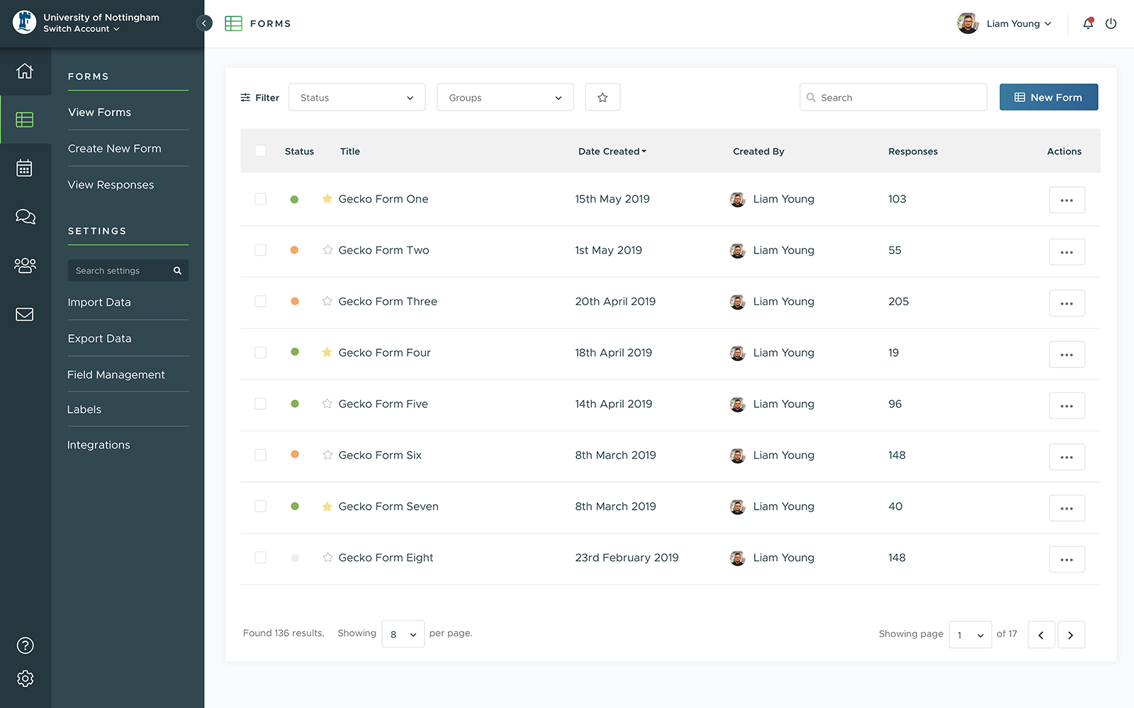 The re-styled system using the Gecko brand colours. I love how the green really pops.
A pretty uninspiring dashboard
When users log in, they are taken to the dashboard. Currently this gives users some pretty basic and uninspiring information. We could be using this space in a far more beneficial way to the users.
One suggestion was to have a “favourite” functionality added. Users could favourite specific form and events and these could be listed on the dashboard, that way they can access these quickly. A handy feature for any upcoming events.
Another feature I thought of was to implement a live feed. Again, very handy for events. Real time data could be shown when students are checking into events and sessions. A little indicator could be displayed to show that the event is currently live.
Both suggestions would add an element of interactivity and hopefully provide some value to an otherwise wasted space.
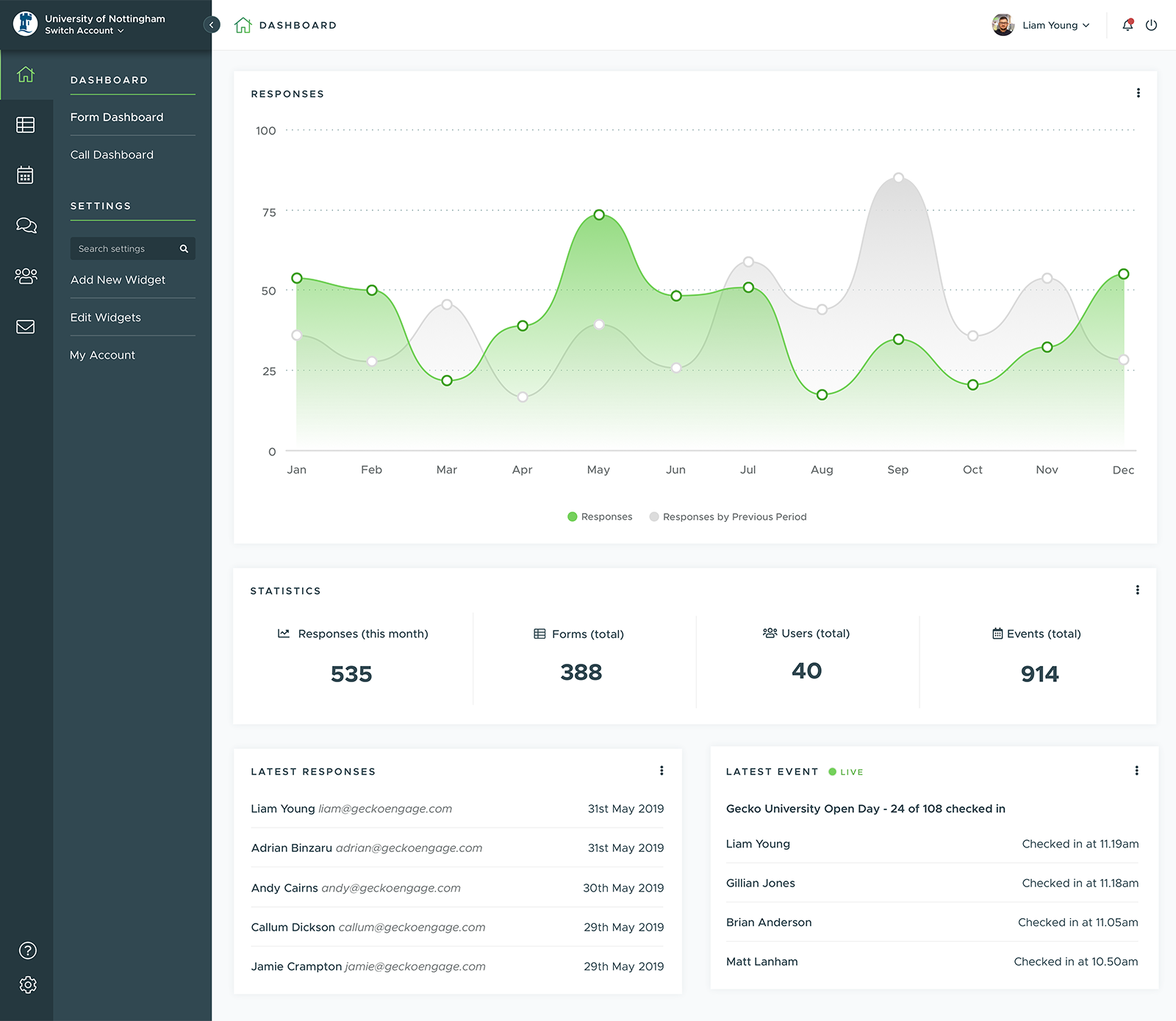 The proposed dashboard. Graphs are now more vibrant and custom widgets now on display.
Thoughts
It sounds like I’m hating on the system a little but the truth is, it is a superb piece of software for the higher education world. Coming in to the company fresh has allowed me to properly evaluate the software and look to make it even better for our client base. Hopefully some of these changes can make the cut at some point in the near future.