 The finalised Gecko Portal landing page. This can be fully customised by customers to meet their own needs and aims.
The main issue was that Gecko Engage and Gecko Chat were really inconsistent with each other. Both products had similar features but were built with different tech and had totally different interfaces. This created silos in the engineering teams, so some areas ended up under-resourced and the design was a bit all over the shop.
Without a proper design system, teams kept wasting time rebuilding the same components again and again. It meant the user experience was fragmented and product development was just way less efficient than it could've been.
I ran conversations with the key people: product managers, designers, and developers from both teams. A few things really stood out from those chats:
This feedback made it pretty clear what we needed: a unified design system that would bring consistency, speed up development, and make it easier for different teams to actually work together.
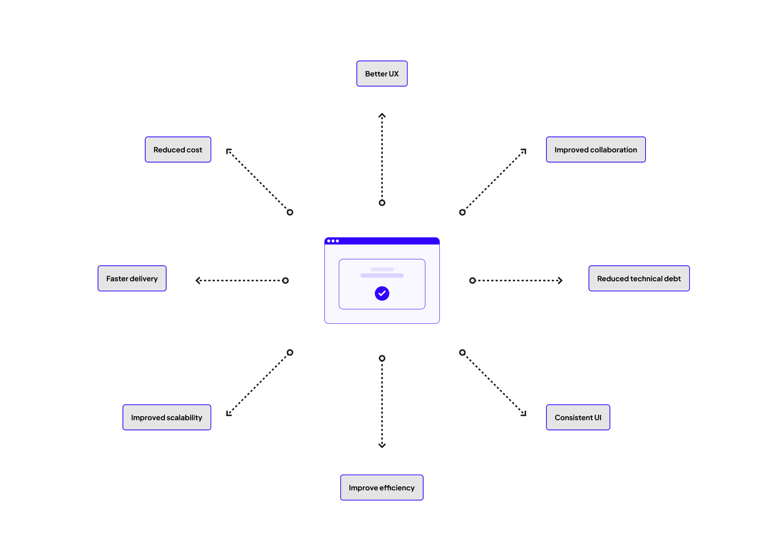 A well crafted design system is central to the success of a product. It can touch many different aspects of the business - from design, engineering, delivery and the end users themselves.
The design system was built around four core principles:
These principles guided every decision we made whilst developing the design system.
I did a full audit of the existing components across both products. This involved:
The audit threw up some interesting results. For example, we discovered that Gecko Chat was using seven (!!!) different dropdown variations. Instead of reusing existing components, bespoke dropdowns were being created to do the same things - this definitely had to change!
I worked closely with Scott and the engineering teams to make sure the design system would be scalable and aligned with our chosen front-end framework, React-Bootstrap. We implemented design tokens for consistent use of colours, typography, and spacing across products (I'd already created this in my Figma design system so we could crack on with that pretty quickly). This meant developers could implement the components consistently in the codebase, which reduced discrepancies between design and development.
A key challenge was making sure components were responsive and scalable across different screen sizes and platforms. By building the design system on React-Bootstrap, we could leverage its responsive grid system and scalable components, but for more custom elements like emoji pickers, chat bubbles, and command windows. We had to build them from scratch or use other React libraries, making sure they fit seamlessly within the overall system.
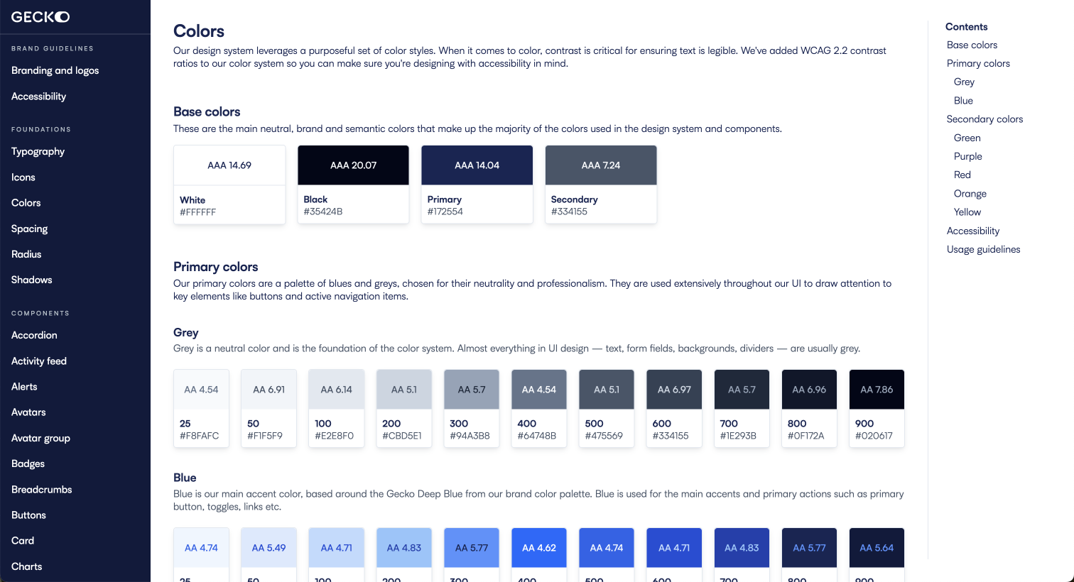
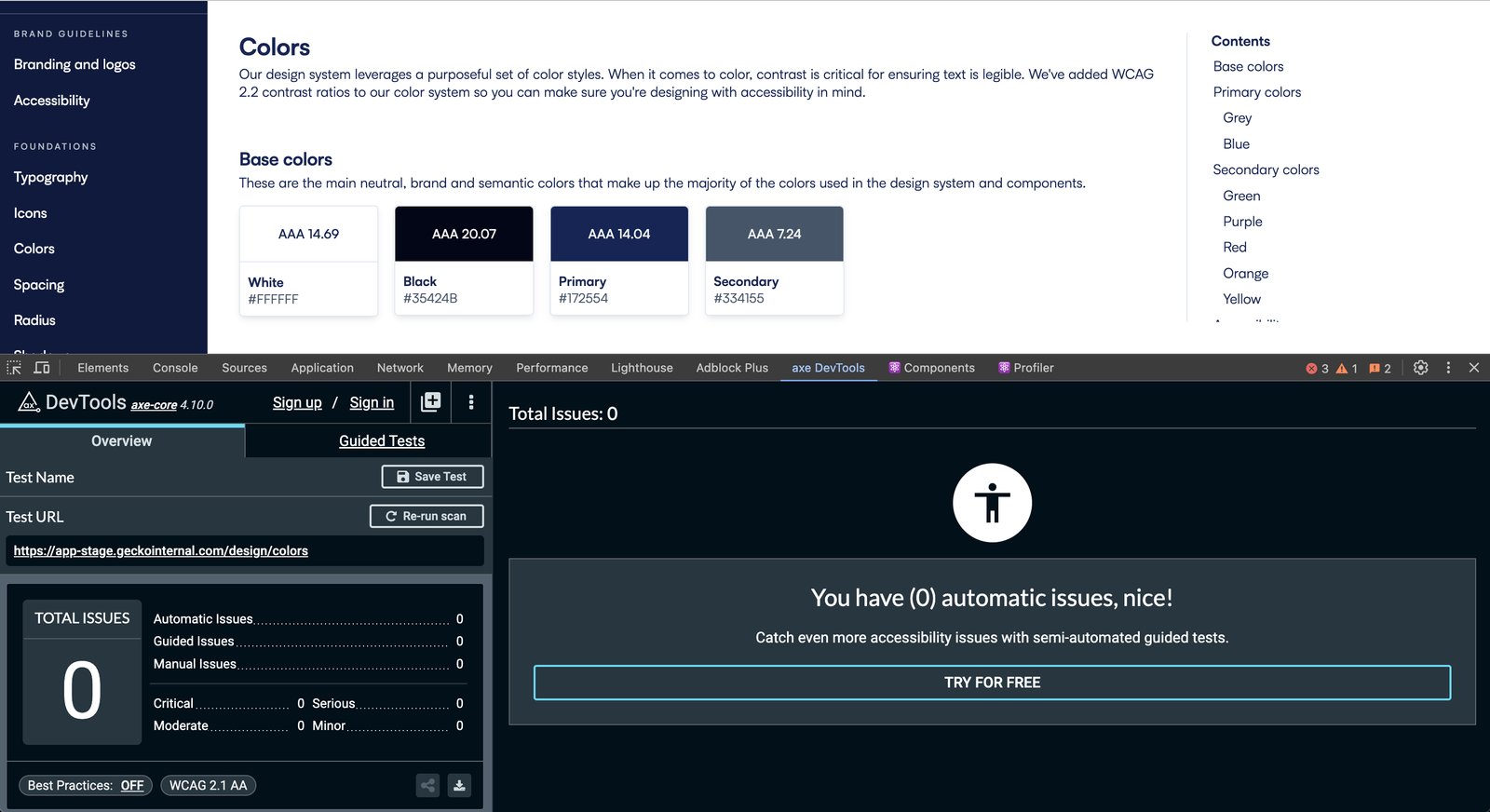 The design system was built with accessibility in mind. One perk of using React-Bootstrap is most accessibility is built in but we have ensured our colour system meets WCAG colour contrast guidelines.
To our advantage I'd already spent time building a Figma design system, so all components had been pre-designed which meant we could build straight away.
When designing the Figma library my focus was on flexibility and adaptability:
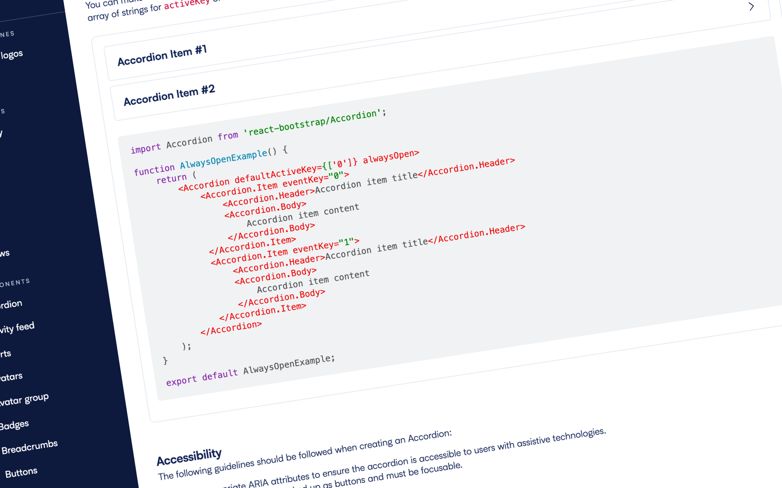
I led the creation of comprehensive documentation for the design system, where each component was documented with:
This documentation became the single source of truth for both designers and developers, reducing miscommunication and making sure collaboration across teams ran smoothly.
Our product is used extensively in the education sector, where accessibility is at the forefront of all institutions' minds, so we made sure accessibility was built into the design system from the start. Every component was tested for:
 Fully documented to assist in usage and implementation, making life easier for everyone.
Once the design system was in place, in collaboration with the engineering department we discussed the best way forward for rolling it out into the wild. We had two options to weigh up:
We were all in agreement that neither option was straightforward, but with the Chat product being significantly less complex, we felt it would be easier to implement the design system there first. After successful deployment, we then rolled it out across the Engage product. This cross-product implementation made sure there was a consistent user experience across the entire Gecko platform and removed all the front-end silos that existed before.
 The design system implemented in our Chat product.
Post-launch, we tracked several key metrics: